

Ubuntu's update season is coming again, with it's usual load of discussing (especially about the famous “disappearing” menus). As every season I started my tour of live version testing with the hope this new release will mature enough to convince me to leave the old 10.04 (LTS) I still have on my EEEPC. So I downloaded the new Ubuntu disk image and prepared a bootable USB drive using, as usual, the tool Ubuntu itself provide.
First impressions
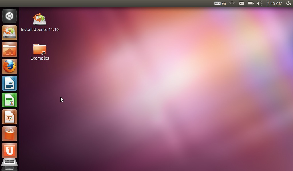
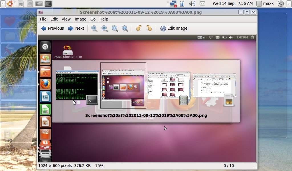
Here is how Ubuntu 11.10 looks like
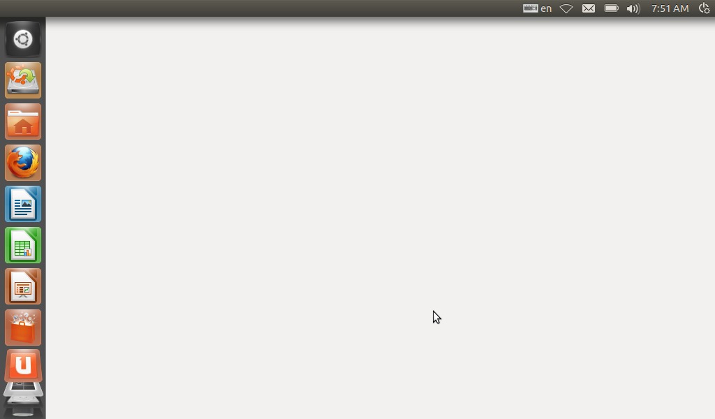
Ubuntu 11.10 Beta is still very unstable on my computer, it happens with beta versions, it presented various errors messages and some odd behaviour, for example the background went blank and did not reappear until I restarted it.
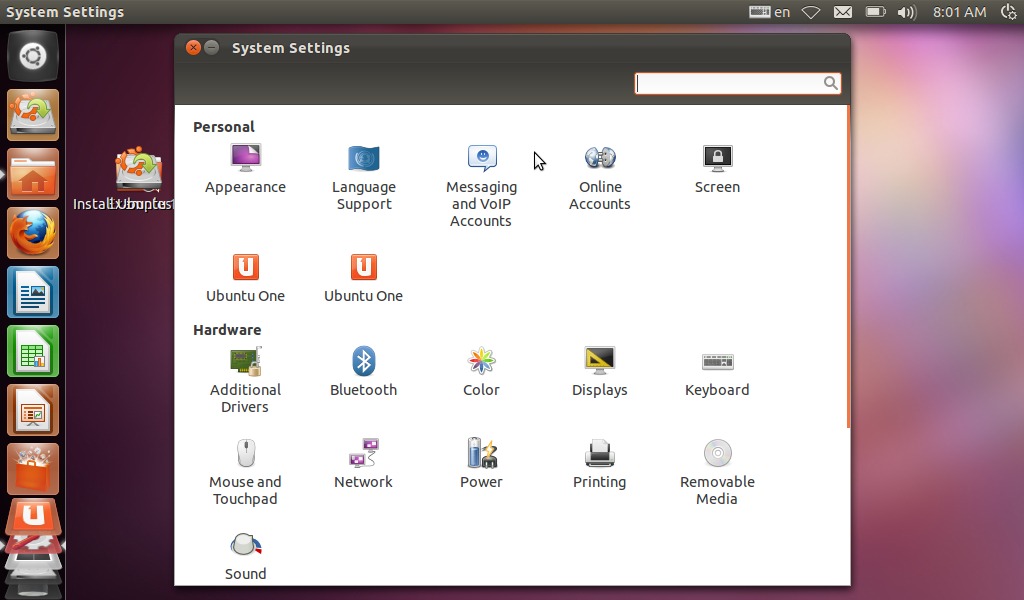
Apart from the “beta errors” the unity interface appears moderately improved for example system settings have been made more accessible by placing them on a menu on the upper right corner.
but many changes seem to me just aesthetic like the new “alt-tab” window switching
nice to see but, is it a real improvement from the one I have on my old 10.04 installation?
The famous disappearing menus ...
There has also been a lot of discussing, on the 'net, about how menus appears only when the mouse is over them, I have to say that I barely noticed it while testing this release, it might be because I look menus only then I need them. By the way It doesn't looks to me hard or even odd to use: in my first mouse-and-windows computer, a Commodore Amiga 500, menus appeared only when right mouse button was pressed. But I don't see it as an improvement either since the free space gained from hiding menus is really insignificant and I can't imagine how It could be implemented on a touch-screen environment. I wonder why there is so much discussing about details so pointless.
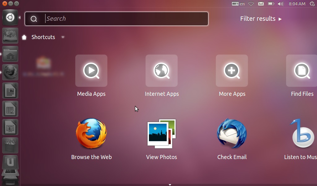
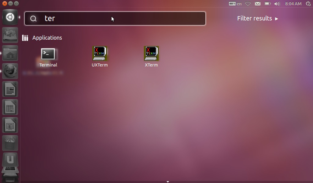
Where are my applications?
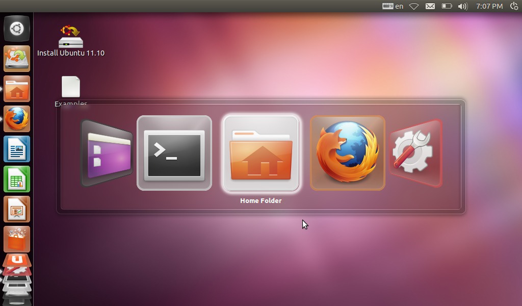
You may have noticed in Unity's button bar the applications buttons is missing. The applications you don't put on Unity's bar can searched by clicking on the top left “Ubuntu” button.
you can search applications by typing their name
If you don't remember how an application is called I suppose you can click on the “More Apps” button (I say “suppose” because it didn't work in my tests). The application browser seems to have some problem to fit the EEEPC screen, so may be I'm missing something. I know I'm going to be repetitive but the applications browser is the main reason that keep me from upgrading to Unity. To search applications by name is an useful option but it shouldn't be the main way to run them. I if liked to remember the name of all application I'd simply run them by the terminal saving lots of RAM and processing power. Seriously why can't we have a well organized application browser with a menu like old GNOME or XFCE, or a tabbed interface like the Ubuntu NBR I'm still using?
Conclusions
I'm not going to upgrade this October. Ubuntu with it's new Unity interface is improving but not enough to be more practical and usable than the version is still installed on my EEEPC. Unity is a good interface but, in my opinion, it still lack too much in flexibility to be competitive.
No comments :
Post a Comment